Lightbox Gallery
Instructions
Overview
Add a responsive image gallery with lightbox functionality to your website, allowing visitors to view images in a full-screen overlay with navigation controls.
Getting Started
Quick Start
- Click the Copy Component button on the top of the page.
- Paste the component into your Webstudio site.
Manual Start
- Add the Script: Copy and paste this code into your website's after the component:
[code-block]<script type="module" src="https://drevo.b-cdn.net/Library/Custom%20Components/Lightbox%20Gallery/lightbox-gallery-v1.2.1.js"></script>[/code-block]
- Add the Required Elements: Create a gallery container with the following structure:
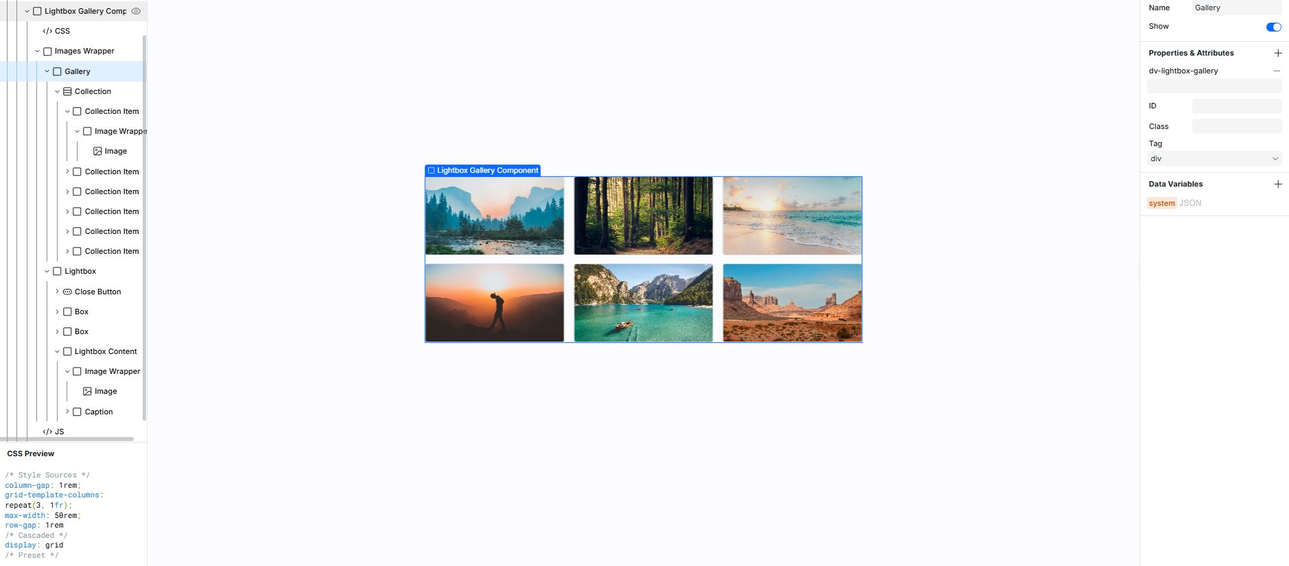
Required Elements
- Gallery Container: Add
dv-lightbox-galleryto the main gallery container - Gallery Items: Each item should be a direct child of the gallery container with an image inside
- Lightbox Container: Add
dv-lightboxto the lightbox overlay container - Lightbox Image: Add
id="dv-lightbox-image"to the image element in the lightbox - Caption Element: Add
id="dv-lightbox-caption"to the caption element in the lightbox - Navigation Buttons:
- Close button: Add
dv-lightbox-close-button - Previous button: Add
dv-lightbox-prev-button - Next button: Add
dv-lightbox-next-button
- Close button: Add
Features
- Keyboard Navigation:
- ESC key: Close the lightbox
- Arrow Left: Previous image
- Arrow Right: Next image
- Enter/Space: Open lightbox when focused on a gallery item
- Accessibility: Maintains focus management for keyboard users
- Responsive Images: Preserves srcset and sizes attributes for optimal image loading
Notes
- The lightbox container should initially be hidden with
style="display: none;" - Body scrolling is disabled when the lightbox is open
- For best results, use consistent image aspect ratios in your gallery