Drevo Library Ultimate Guide - Build Powerful Webstudio Websites Faster
A full guide of everything there is to know about what is and how to use Drevo Library for Webstudio websites
Understanding Drevo Library Components
Drevo Library offers two types of components: Starter Components and Custom Components. Let’s start with the Starter Components.
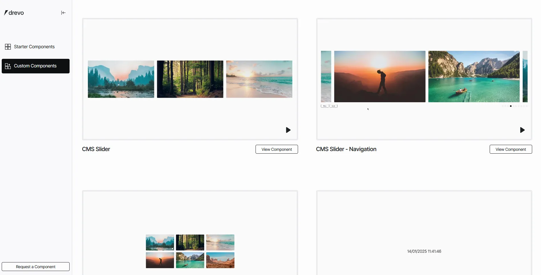
Starter Components
These are pre-made UI components that you can easily add to your Webstudio site. The goal is to provide a solid foundation and speed up your workflow so you can build your website faster and more efficiently.
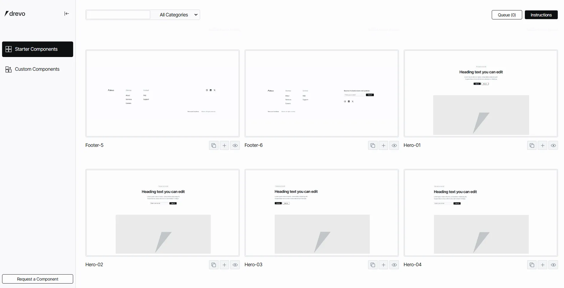
Before adding these components to your site, there are a couple of things to consider:
We can use these Starter Components with either the Craft Style Guide or the Drevo Library Style Guide.
Craft Style Guide vs. Drevo Library Style Guide
As you know, Craft is the official way of building in Webstudio, and it’s an amazing system. Drevo Library is built on top of the Craft Style Guide with a few small additions.
The Drevo Library Style Guide (DL Style Guide) introduces Utility Tokens to apply consistent spacing throughout all components.
For example, the utility token flex-gap-s applies display: flex and a small gap CSS variable (gap-s). When you see this type of utility token in different places, you’ll immediately know the spacing applied.
Setting Up Starter Components Correctly
If you copy and paste a component directly into Craft without the necessary setup, things might look messy. That’s because the Utility Tokens and gap CSS variables are missing.
Fixing the Layout:
Go to the DL Style Guide. (you don’t need to clone it for this step).
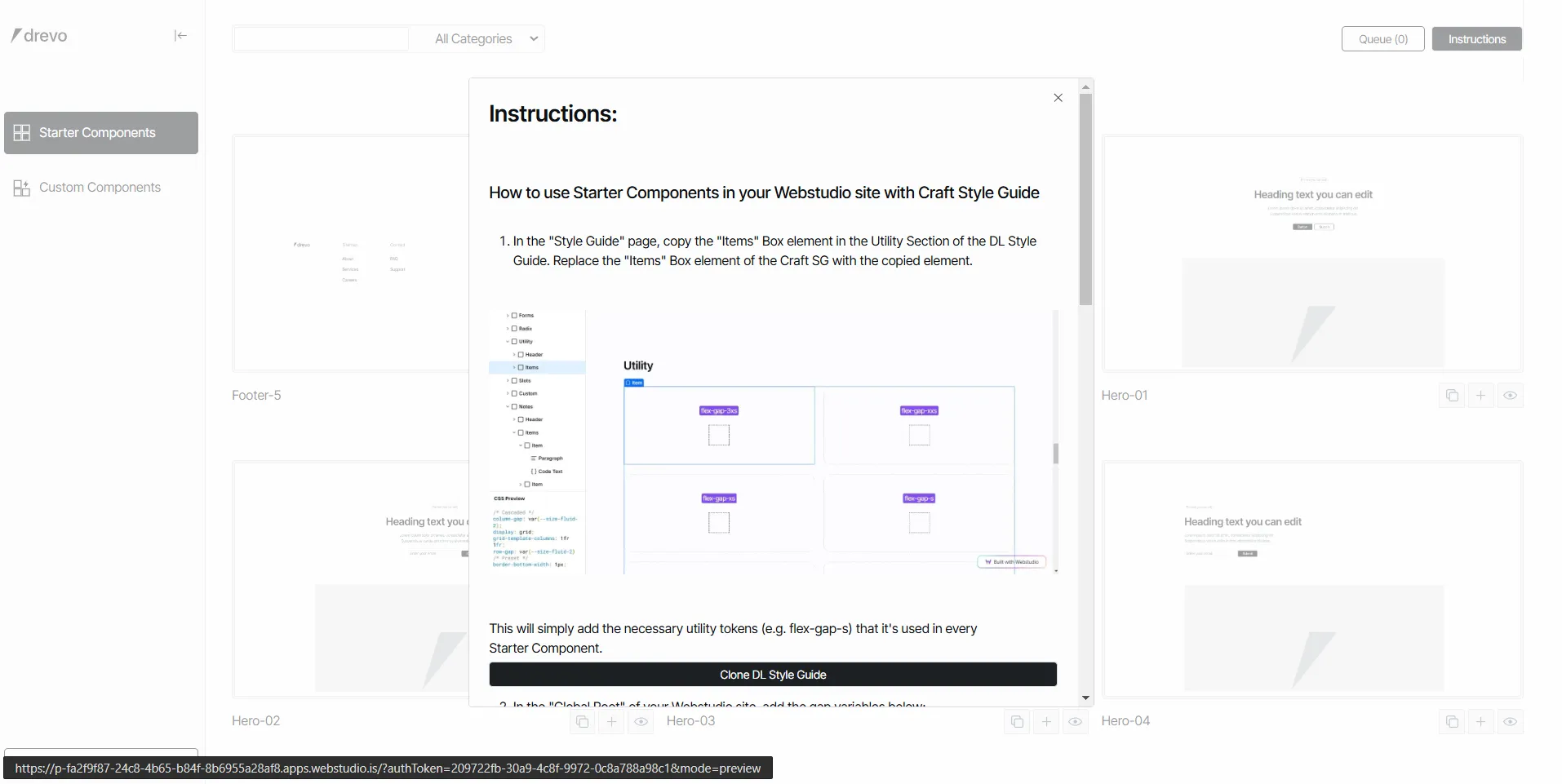
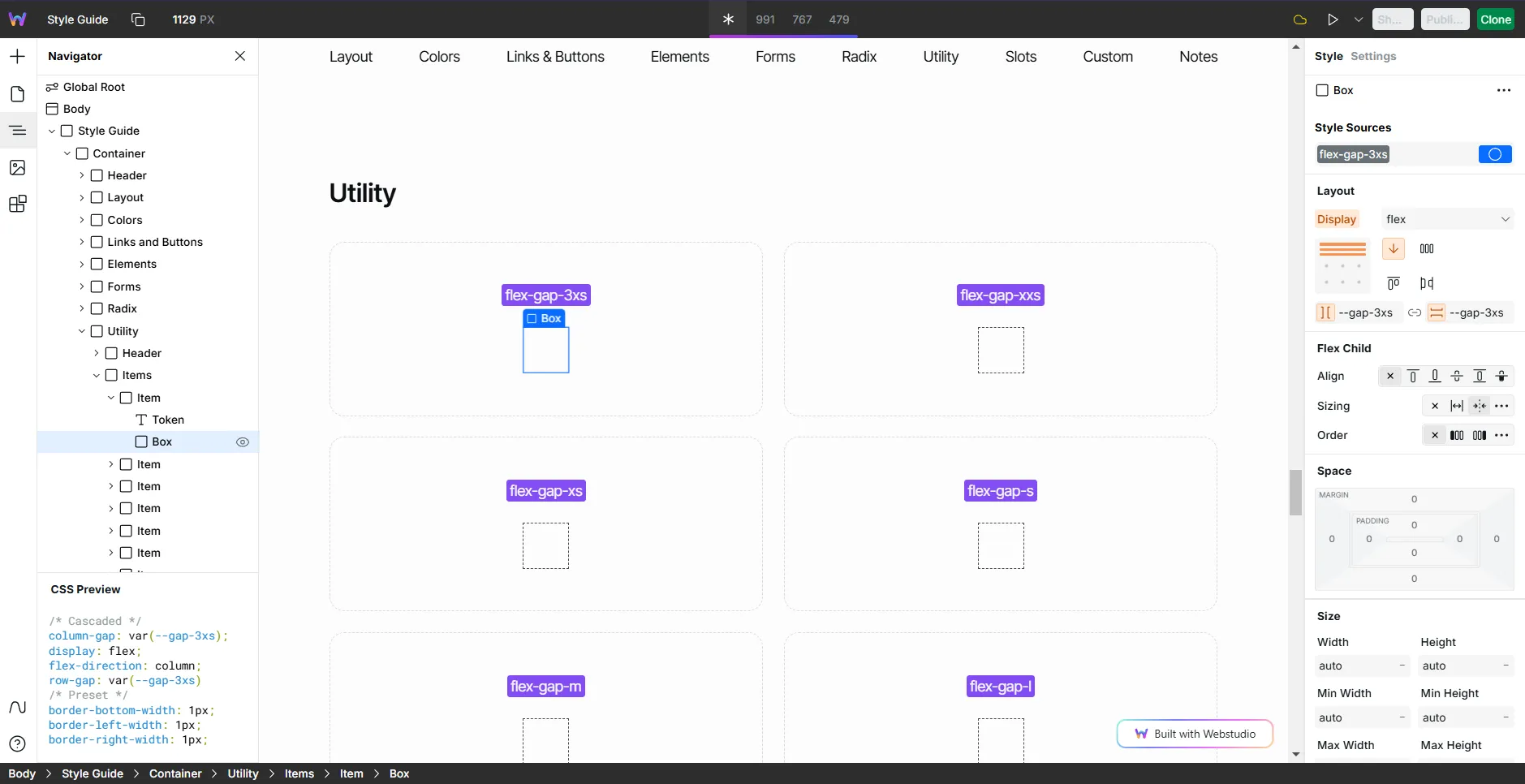
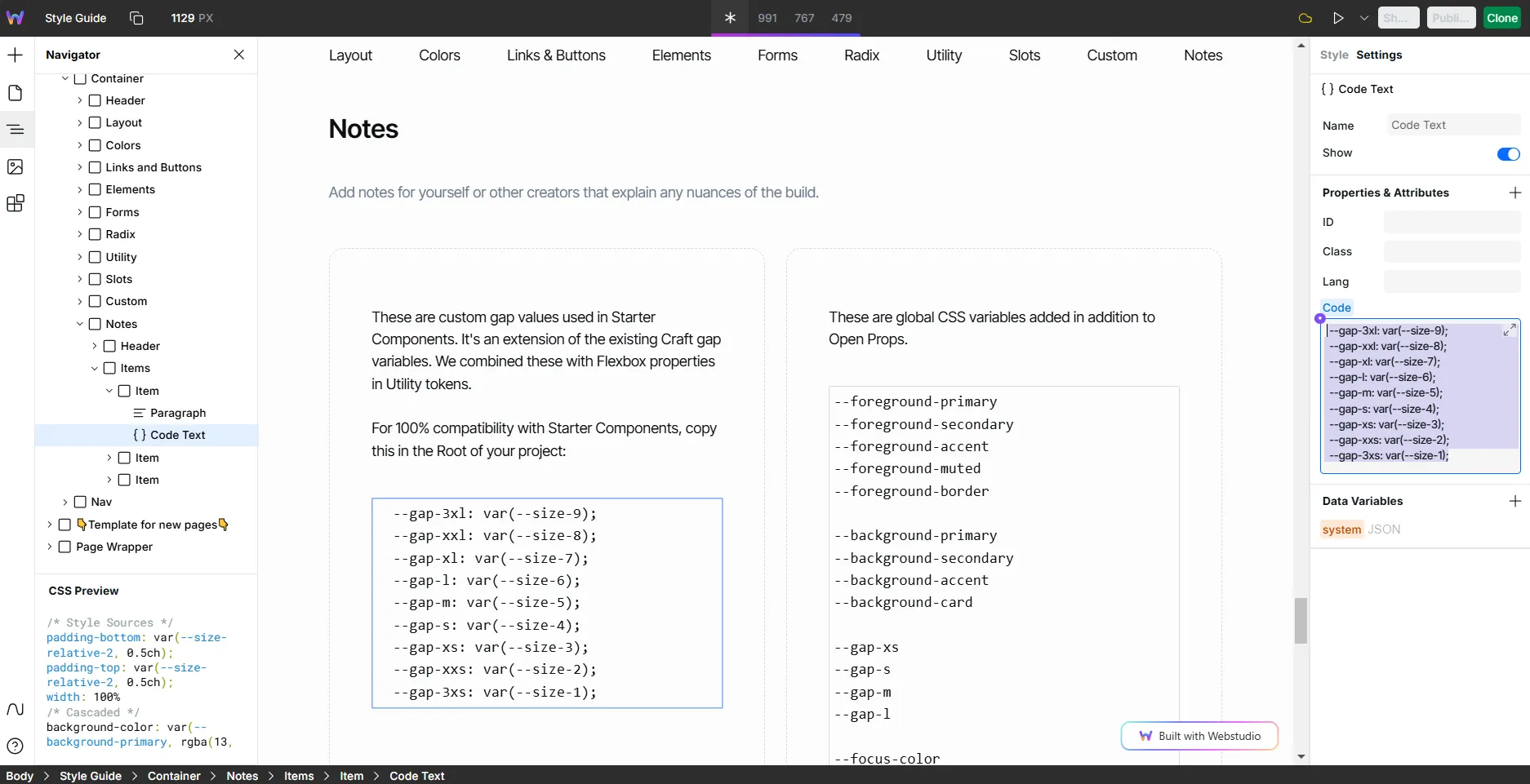
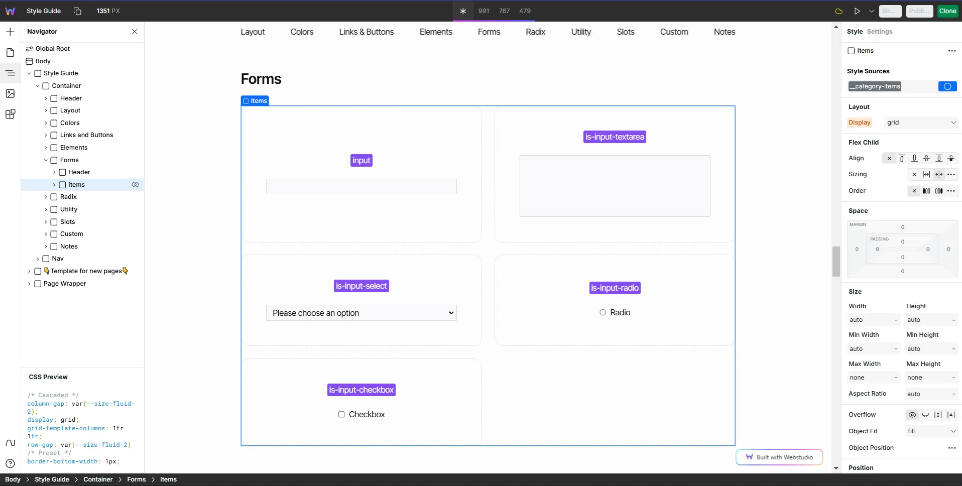
Go to the "Utility" Section on the "Style Guide" page, then copy this "Items" Box highlighted in the image.
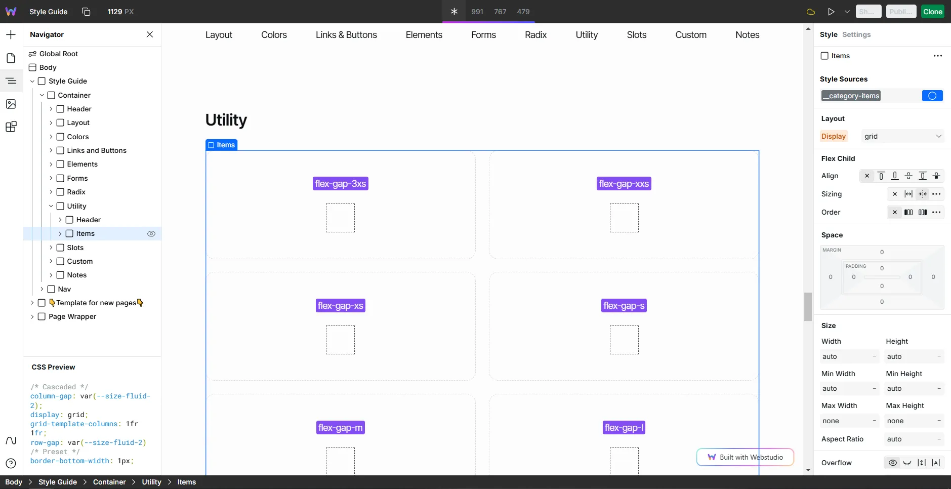
Replace this same element you copied with the equivalent of the Craft Style Guide. So the Utility section of your Craft Style Guide should look the same as it is in the image above
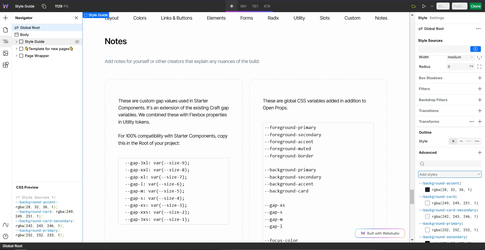
To check, click on any of the boxes below the purple element. If you can see the token in the Style Sources, then we're good.
The last step is to add the new gap vars. They will match the naming of the Utility tokens so it's easy to recognize. So, in the DL Style Guide, copy the gap vars as demonstrated in the image below:
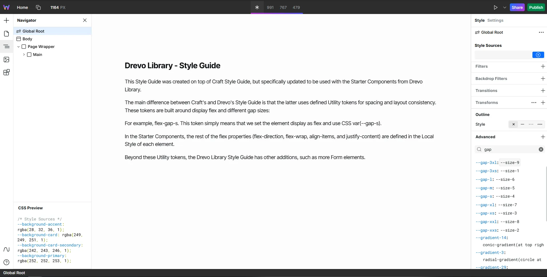
Then paste this copied text into the "Add Styles" input inside the "Advanced" panel:
To check, type "gap" in the "Advanced" search bar, and it should look something like this:
That's it! Now when you paste a Starter Component in your project, all spacing should be preserved!
Cloning the Drevo Style Guide
If you want to skip the setup steps, you can simply clone the Drevo Style Guide, which already includes all the tokens, variables, and additional features.
Using the Queue Feature
Once your setup is ready, you might want to copy multiple components at once to save even more time. That’s where the Queue feature comes in.
Add multiple components to the queue.
View, rearrange, or delete them as needed.
Click Copy All and paste them into your site.
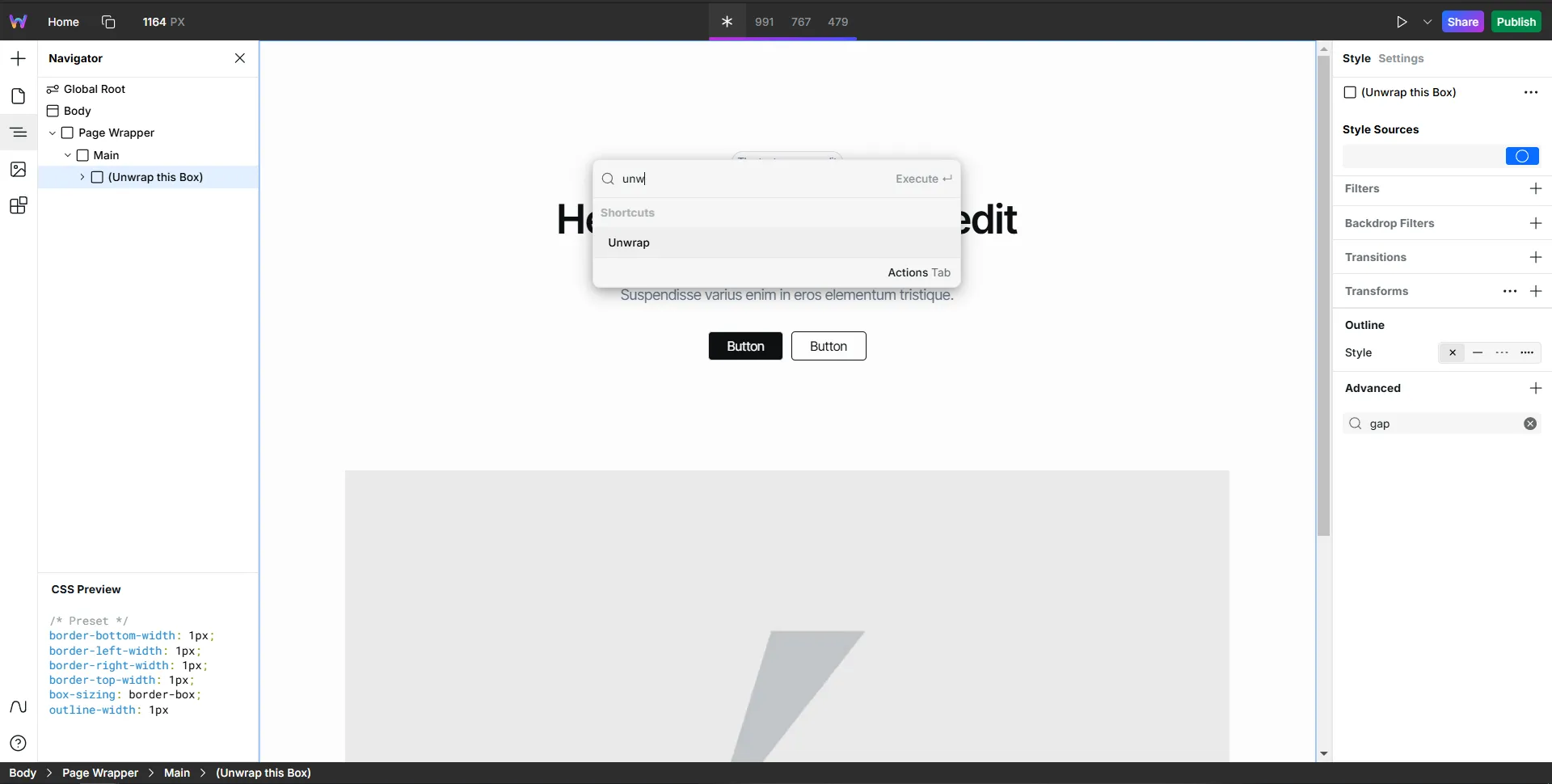
You’ll see a box labeled Unwrap this Box. Simply search for the Unwrap command, and your components will appear in the order you set.
Custom Components
Now let's go to the Custom Components. They are components that require code, but I adapted them to make as no-code as possible.
Let's take Scramble Text as an example.
Scramble Text Component
You can add Custom Components in two ways (It's up to you):
One-click copy and paste
Step-by-step manual setup
How It Works
Here you have the structure and the script, that feeds the component with the code:
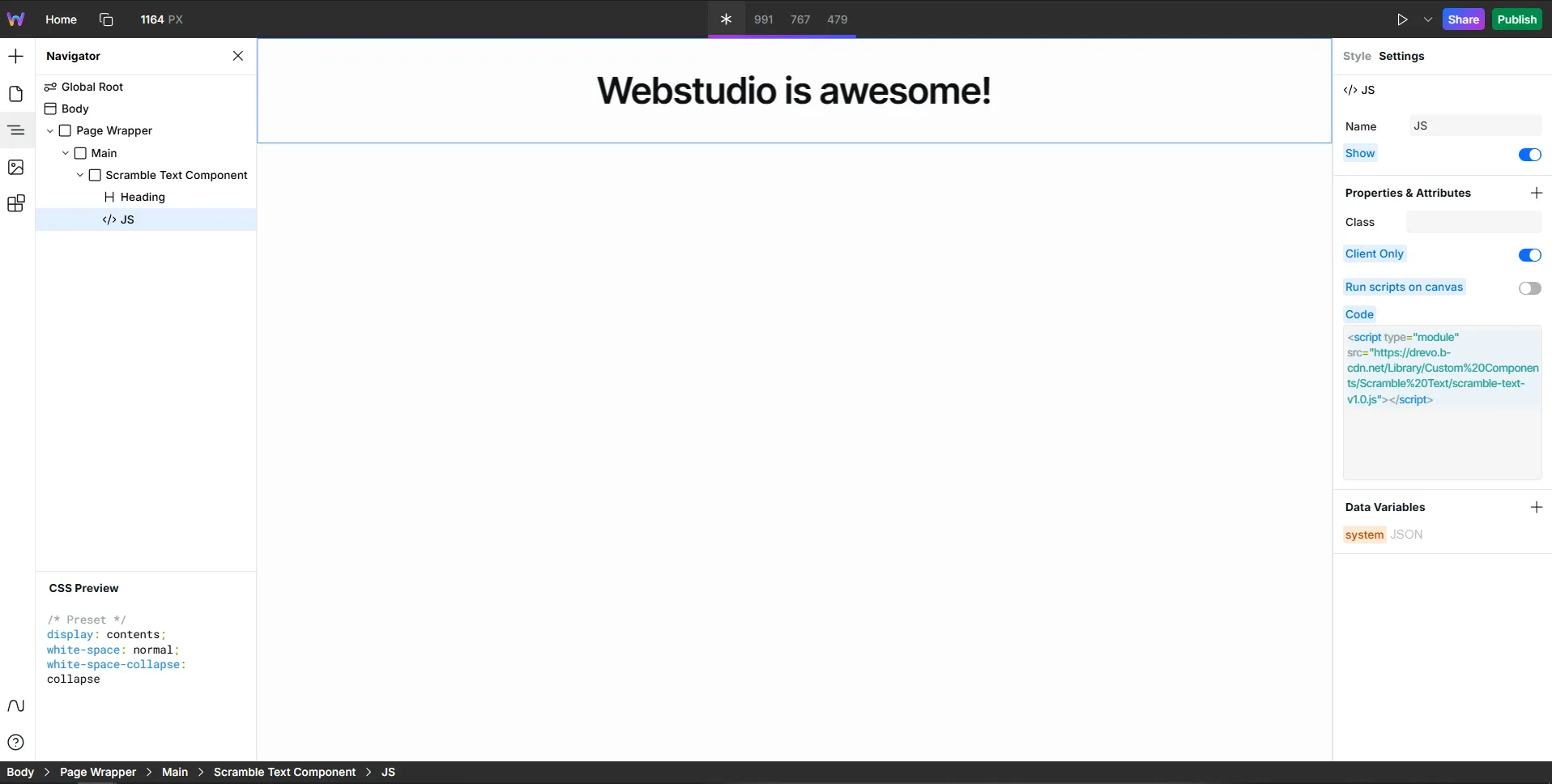
In the Settings, we have the custom attribute with multiple settings. This is the place where you can customize all code-related properties:
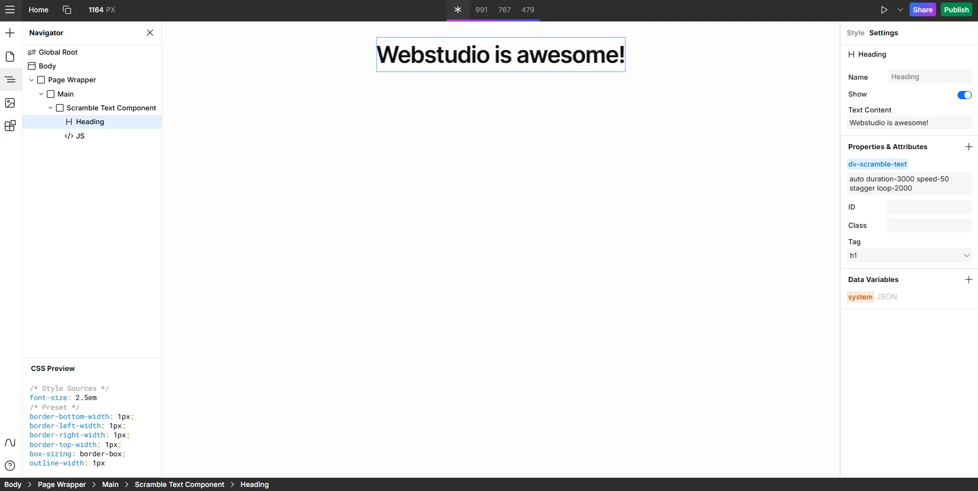
For example, let’s say you want the scramble animation to last longer (from 3000 milliseconds to 5000) and the loop to happen faster (from 2000 milliseconds to 1000 milliseconds).
Simply adjust the settings—no coding is required!
So from this: dv-scramble-text="auto duration-3000 speed-50 stagger loop-2000"
It would look like this: dv-scramble-text="auto duration-5000 speed-50 stagger loop-1000"
Be sure to read the instructions carefully to see what customization options are available.
More about Drevo Library Style Guide
There are more few surprises in the DL Style Guide:
Forms Elements
All common form elements were added and styled using the standard variable colors.
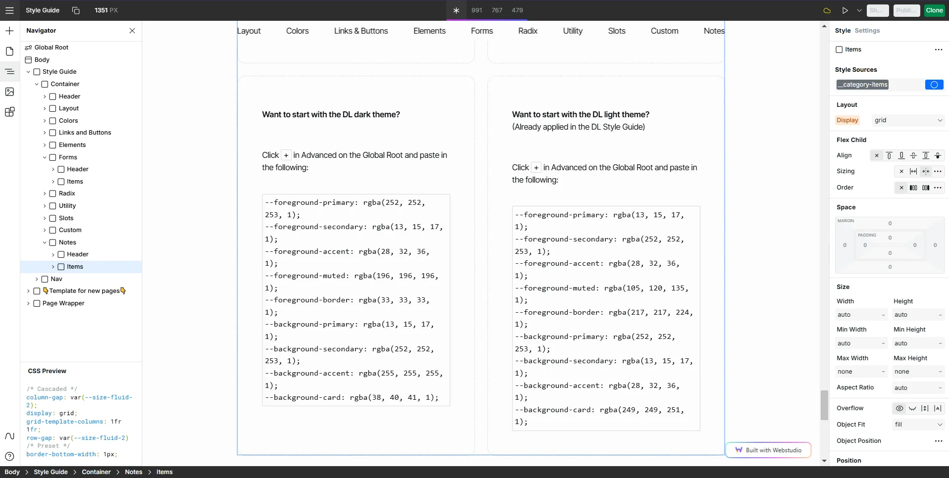
Drevo Library Light/Dark Theme
If needed, all Color vars from DL Style Guide are ready to be copied and pasted!
They are especially useful if you are starting from the DL Clone but your website will be dark, or if you are starting from Craft Style Guide and want to start with the colors from the Drevo Library.
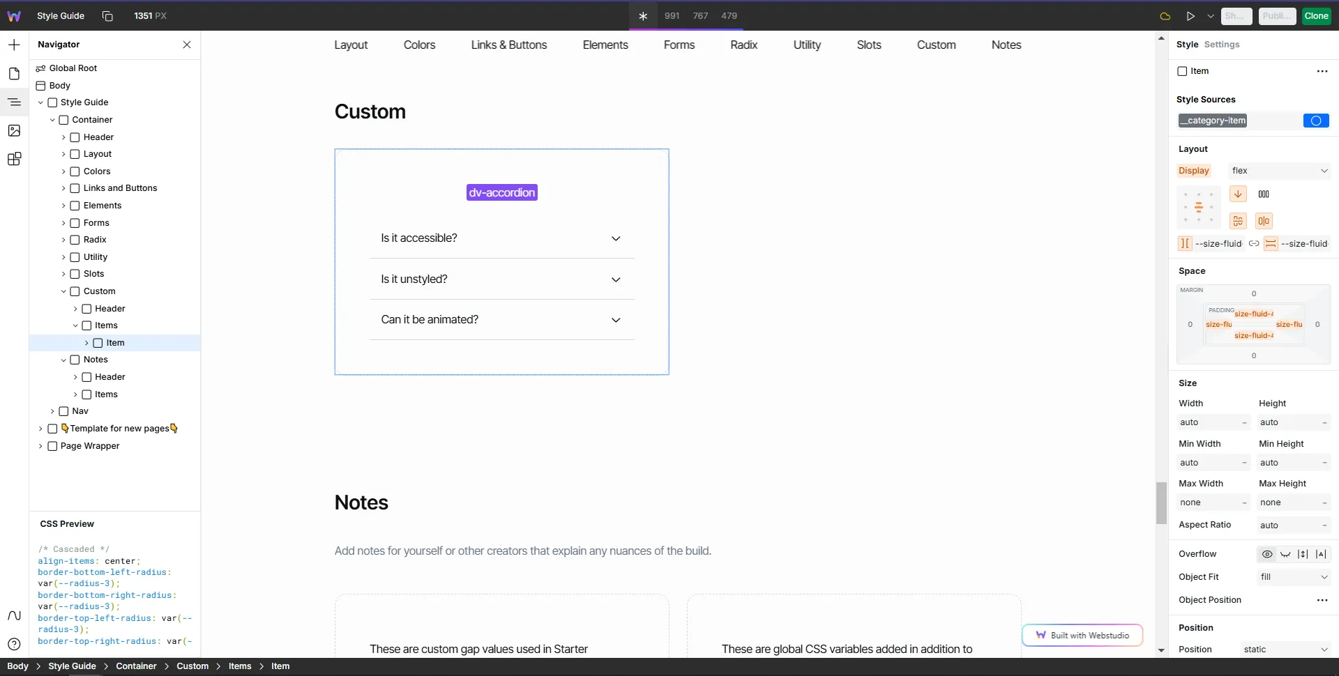
Custom Elements
These will be elements that might be useful or would be nice to have a variation.
One example is the dv-accordion . This was made because I wanted to add an accordion in our FAQ Starter Components but to have more control over the animation. So I figured to make this a Custom element for anyone who might be interested.
Request New Components and Stay Updated
Request new components
Feel free to request a component (whether is Starter or Custom) that you might need or think will be useful. If it's a good fit, I'll be adding it to the Drevo Library.
Follow the roadmap to see upcoming features: https://drevolibrary.featurebase.app/en/roadmap
If you have any questions, feel free to reach out via X (formerly Twitter) or email (viniciusmoreira@drevo.digital).
Conclusion
My goal for Drevo Library is to make Webstudio devs and designers build powerful websites faster, and your feedback will be extremely helpful in this goal, so if you have a few minutes to spare, I'd love to hear what you have to say: https://tally.so/r/w8MB15
Thanks for reading this far, and keep building!