CMS Slider
Overview
Add a responsive, customizable content slider to your website.
Getting Started
Quick Start
- Copy any slider from the Demo page and the script.
- Paste into your Webstudio site.
Important: Some of the Slider styles are dependent on the Craft design system. Make sure to add Craft to your site for maximum compatibility
Manual Start
- Add the Script: Copy and paste this code into your website's after the component:
[code-block]<script src="https://drevo.b-cdn.net/Library/Custom%20Components/CMS%20Slider/cms-slider-v2.0.js"></script>[/code-block]
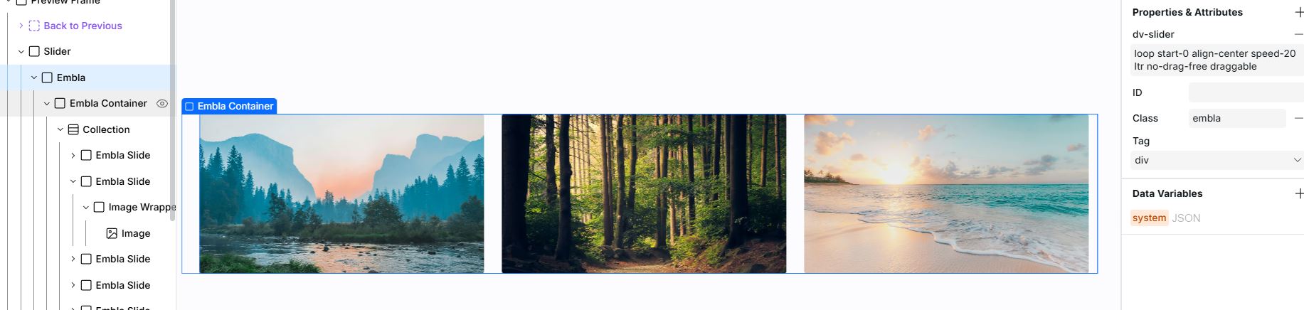
- Add the Slider Structure: Create a container with the following structure:
Customization Options
Slider Settings
Add these options to the dv-slider attribute:
loop/no-loop= Enable/disable infinite looping.drag-free/no-drag-free= Enable/disable momentum scrolling.align-start/align-center/align-end= Slide alignment.start-X= Starting slide index (default: 0)autoplay-X= Enable slider autoplay. X is the interval in ms. Below are attribute values specific toautoplayrtl/ltr= Direction of slider movement (default: ltr [left-to-right])
Example: dv-slider="loop align-start"
Navigation Elements
- Container: Add class
emblato the main slider container - Slides Container: Add class
embla__containerto the direct parent of slides - Slides: Add class
embla__slideto each individual slide - Dots: Add class
embla__dotsto the dots container (automatically populated) - Buttons: Add classes
embla__button--prevandembla__button--nextto navigation buttons
Styling Navigation Dots
To override the dot styles, add a custom style element with the following CSS (keep the !important flags):
[code-block lang="css"].embla__dot { background-color: var(--background-card-secondary) !important; border-radius: 50% !important; width: 1rem !important; height: 1rem !important; border: 1px solid var(--foreground-border) !important; cursor: pointer !important; } .embla__dot--selected { background-color: var(--foreground-primary) !important; } [/code-block]
Note:
drag-freedoesn't work withautoplayor when navigation controls.
Notes
- The component automatically loads the Embla Carousel library
- The component applies minimal styling to allow for custom designs
- Slides can contain any HTML content, including images, text, and other HTML elements.